AV
Over the past few years, I’ve worked across multidisciplinary teams, partnering with product managers, engineers, and stakeholders to design solutions that are both user-centred and technically grounded.
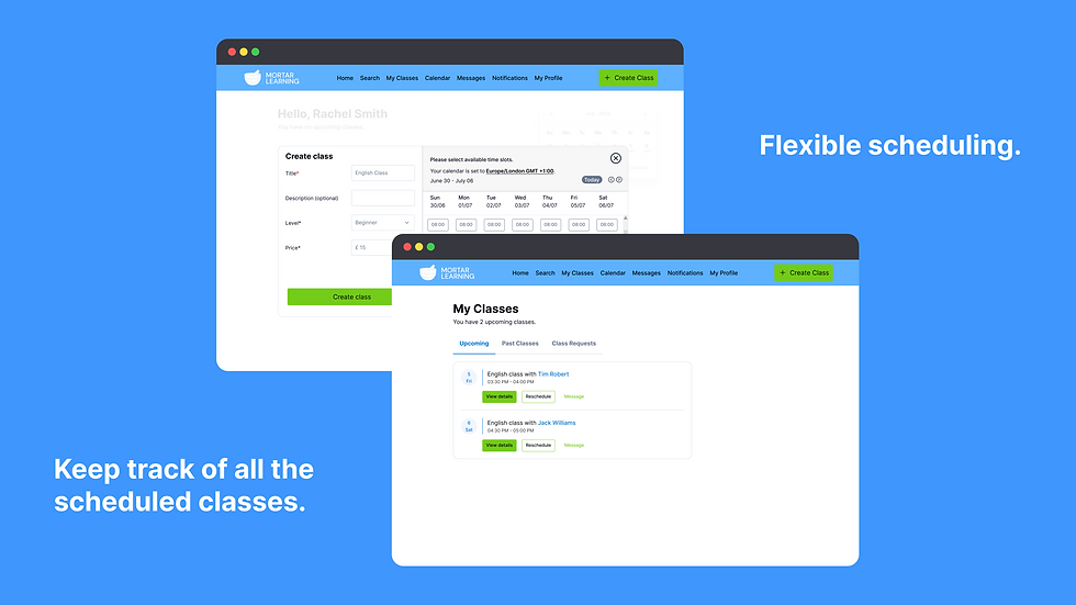
Designing an MVP for a language learning platform empowering learners and tutors
Client
Mortar Learning
Industry
EdTech
Platform
Web
Team
1 Project Manager
1 Developer
2 Data Analysts
1 Product Designer
My Role
Product Designer
Timeline
March 2024-Present
Designing a parking app to improve urban infrastructure
Designing a companion app for smart, automated parking access
Client
Parking Dome
Industry
Mobility-B2C
Platform
iOS
Team
Solo designer, collaborated with stakeholders
1 Developer
2 Data Analysts
1 Product Designer
My Role
End-to-end UX Design
Timeline
May 2023-September 2023
Over the past few years, I’ve worked across multidisciplinary teams, partnering with product managers, engineers, and stakeholders to design solutions that are both user-centred and technically grounded.
How I Work
I approach design as a decision-making discipline, not just a creative one.
That means:
Starting with problem framing, not screens
Understanding technical, business, and human constraints early
Designing for real-world conditions, not ideal scenarios
Making trade-offs explicit and intentional
I value clarity over complexity, and I focus on designing experiences that are simple to use, resilient under pressure, and scalable over time.

How I Work
I approach design as a decision-making discipline, not just a creative one.
That means:
Starting with problem framing, not screens
Understanding technical, business, and human constraints early
Designing for real-world conditions, not ideal scenarios
Making trade-offs explicit and intentional
I value clarity over complexity, and I focus on designing experiences that are simple to use, resilient under pressure, and scalable over time.

How I Work
I approach design as a decision-making discipline, not just a creative one.
That means:
Starting with problem framing, not screens
Understanding technical, business, and human constraints early
Designing for real-world conditions, not ideal scenarios
Making trade-offs explicit and intentional
I value clarity over complexity, and I focus on designing experiences that are simple to use, resilient under pressure, and scalable over time.

How I Work
I approach design as a decision-making discipline, not just a creative one.
That means:
Starting with problem framing, not screens
Understanding technical, business, and human constraints early
Designing for real-world conditions, not ideal scenarios
Making trade-offs explicit and intentional
I value clarity over complexity, and I focus on designing experiences that are simple to use, resilient under pressure, and scalable over time.
How I Work
I approach design as a decision-making discipline, not just a creative one.
That means:
Starting with problem framing, not screens
Understanding technical, business, and human constraints early
Designing for real-world conditions, not ideal scenarios
Making trade-offs explicit and intentional
I value clarity over complexity, and I focus on designing experiences that are simple to use, resilient under pressure, and scalable over time.

Overview
Parking Dome is a UK-based smart parking solution combining automated robotic barriers with a mobile companion app. The app enables drivers to discover, book, and access parking spaces, while allowing parking space owners to monetise unused capacity.
I designed the end-to-end mobile experience for both user groups as part of my MSc dissertation, working with a real UK-based company. My role focused on translating a hardware-first system into a clear, reliable digital experience.


Core Problem
Parking is a high-friction, time-sensitive experience. Users typically engage with it:
Under time pressure
In unfamiliar environments
With low tolerance for failure
For Parking Dome, the risk was clear:
If access failed at the point of arrival, trust in the entire system would collapse.
The core problem was therefore not booking or payments; it was designing a reliable, intuitive digital experience that users could trust at the exact moment it mattered most.
Goals
Enable users to book parking spaces quickly and confidently
Provide seamless, secure access via an automated barrier
Support parking space owners in listing and managing availability
Design a mobile-first experience suitable for real-world, on-the-move usage
Constraints
-
Integration with physical hardware (robotic barrier)
-
High reliability required at the point of arrival
-
Security concerns around access and key sharing
-
No live system available for real-world testing
These constraints significantly shaped both interaction design and visual hierarchy.
User Groups
Drivers booking short-term parking in urban environments
Parking space owners renting unused private parking spaces
Each group had different motivations, but both depended on clarity, predictability, and trust.
Discovery & Insights
Research included:
-
Interviews and surveys with urban drivers
-
Analysis of existing parking and sharing platforms
-
Stakeholder discussions with the Parking Dome team
Key Insight
The moment of arrival is the most critical point in the experience.
Any ambiguity around access such as unclear status, delayed feedback, or confusing controls would immediately undermine trust in both the app and the physical system.
Teachers prioritised:
-
Speed
-
Clarity
-
Confidence that onboarding would lead to real teaching opportunities
Key Design Decisions
1. Treat onboarding as an activation problem, not a form-filling task
Rather than designing onboarding to capture all possible information upfront, we prioritised activation over completeness.
The primary question became:
“What is the minimum required for a teacher to start teaching?”
2. Reduce onboarding to three intentional steps
Based on competitive analysis, we designed a three-step onboarding flow:
-
Account creation and basic profile
-
Teaching credentials and availability
-
Review and publish
This reduced cognitive load and made progress immediately visible, while still supporting future expansion.
Trade-off:
This limited profile depth at onboarding, but significantly reduced the risk of early abandonment.
3. Use progressive disclosure for advanced setup
More complex tasks (profile optimisation, additional credentials, preferences) were deferred until after onboarding.
This allowed teachers to:
-
Complete onboarding quickly
-
Refine their profiles once value was established
4. Prioritise clarity and feedback at every step
Each step included:
-
Clear progress indicators
-
Inline validation
-
Microcopy designed to reduce uncertainty
The goal was to ensure teachers always understood:
-
Where they were
-
What was required
-
What would happen next
Key Design Decisions
1. Treat onboarding as an activation problem, not a form-filling task
Rather than designing onboarding to capture all possible information upfront, we prioritised activation over completeness.
The primary question became:
“What is the minimum required for a teacher to start teaching?”
2. Reduce onboarding to three intentional steps
Based on competitive analysis, we designed a three-step onboarding flow:
-
Account creation and basic profile
-
Teaching credentials and availability
-
Review and publish
This reduced cognitive load and made progress immediately visible, while still supporting future expansion.
Trade-off:
This limited profile depth at onboarding, but significantly reduced the risk of early abandonment.
3. Use progressive disclosure for advanced setup
More complex tasks (profile optimisation, additional credentials, preferences) were deferred until after onboarding.
This allowed teachers to:
-
Complete onboarding quickly
-
Refine their profiles once value was established
4. Prioritise clarity and feedback at every step
Each step included:
-
Clear progress indicators
-
Inline validation
-
Microcopy designed to reduce uncertainty
The goal was to ensure teachers always understood:
-
Where they were
-
What was required
-
What would happen next
Key Design Decisions
Decision 1: Design the app as a focused companion, not a feature-heavy platform
The app was intentionally designed to support a single primary flow:
Book → Navigate → Access → Exit
Secondary features were deprioritised to avoid distraction during high-stress moments.
Trade-off:
This limited feature breadth, but significantly improved clarity and reliability.
Decision 2: Prioritise access clarity over visual complexity
At the moment of arrival, the app always answered one question:
“Can I park here right now?”
Clear status indicators communicated:
Booking confirmation
Barrier readiness
Barrier access key sharing
This reduced uncertainty and prevented users from second-guessing the system.
Key Design Decisions
Decision 3: Secure, contextual access sharing
Access keys were designed to be:
Time-bound
Location-aware
Automatically triggered on arrival
This balanced ease of use with security, while minimising manual actions from the user.
Key Design Decisions
Decision 4: Design for real-world conditions
The interface prioritised:
High contrast
Large tap targets
Clear typography
The app was designed for use outdoors, often in motion or under time pressure, rather than ideal conditions.
-
Where they were
-
What would happen next
-
What was required
Design Execution
Designed end-to-end user journeys for both drivers and space owners
Created wireframes, high-fidelity UI, and interactive prototypes
Focused on clear hierarchy and minimal cognitive load
Worked within hardware constraints to ensure technical feasibility
Collaboration & Process
We worked in weekly Agile sprints, involving:
-
Product Manager
-
Founder (CEO)
-
Developer
-
Data Analysts
-
Me as Product Designer
Design decisions were reviewed collaboratively, with frequent alignment on scope, feasibility, and priorities. I facilitated design reviews and ensured design intent was clearly communicated to development.
Outcome
Delivered a validated mobile companion app concept aligned with the physical barrier system
Provided the company with a clear UX direction for integrating software with hardware
Demonstrated how digital experience could improve trust in a hardware-led product
The project was paused prior to launch due to organisational constraints unrelated to design or delivery.

Prototype
What This Work Achieved
Although the product was not deployed live:
The concept de-risked the access experience at the most critical moment
Established a clear interaction model for future development
Highlighted UX considerations essential for physical–digital systems
What I’d Improve Next
With live deployment, the next priorities would include:
Testing with real hardware in varied environments
Designing robust offline and failure states
Introducing post-parking feedback to identify breakdown points
Key Learnings
In physical–digital products, reliability matters more than feature richness
The most critical UX moments often occur outside ideal conditions
Designing for failure states is as important as designing for success
Temp
I approach design as a decision-making discipline, not just a creative one.
That means:
-
Minimise friction during teacher onboarding
-
Enable teachers to reach “ready to teach” status as quickly as possible
-
Balance simplicity with necessary verification requirements
-
Establish a scalable onboarding foundation for future features
I value clarity over complexity, and I focus on designing experiences that are simple to use, resilient under pressure, and scalable over time.
Let's work together
If you’re building products that value clarity, usability, and thoughtful design, I’d be glad to explore how I can contribute.